The challenge
La Prairie Village is a family farm park with a western, ranch-style experience. The name needed a mark with real character — playful for children, authentic enough for adults, and strong on signage, tickets and merchandise.
Overview
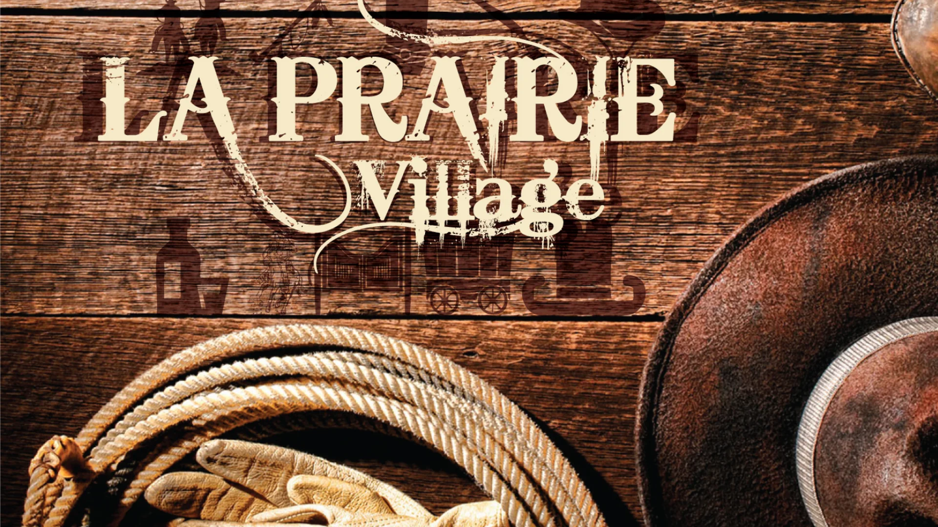
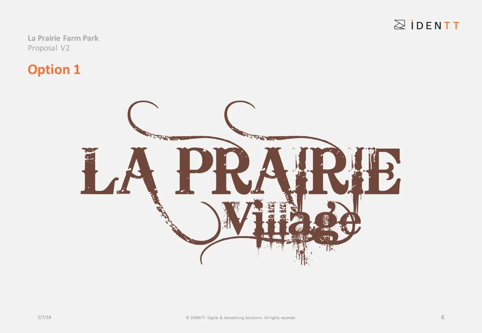
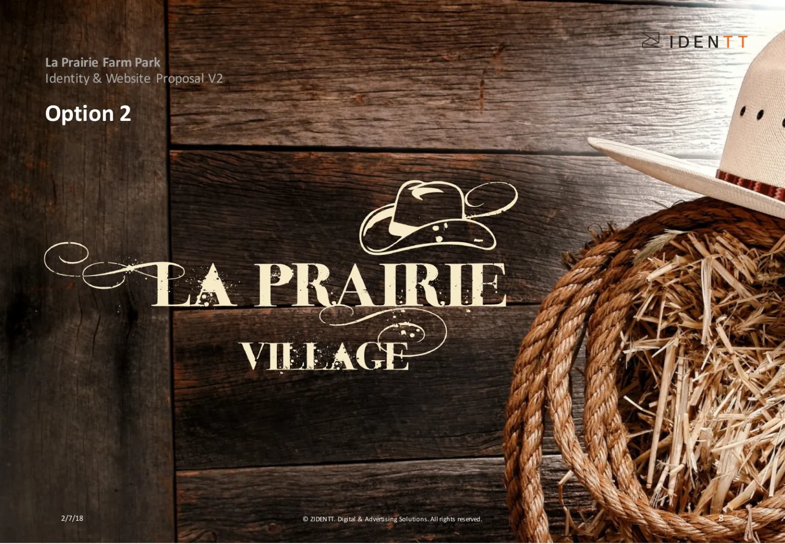
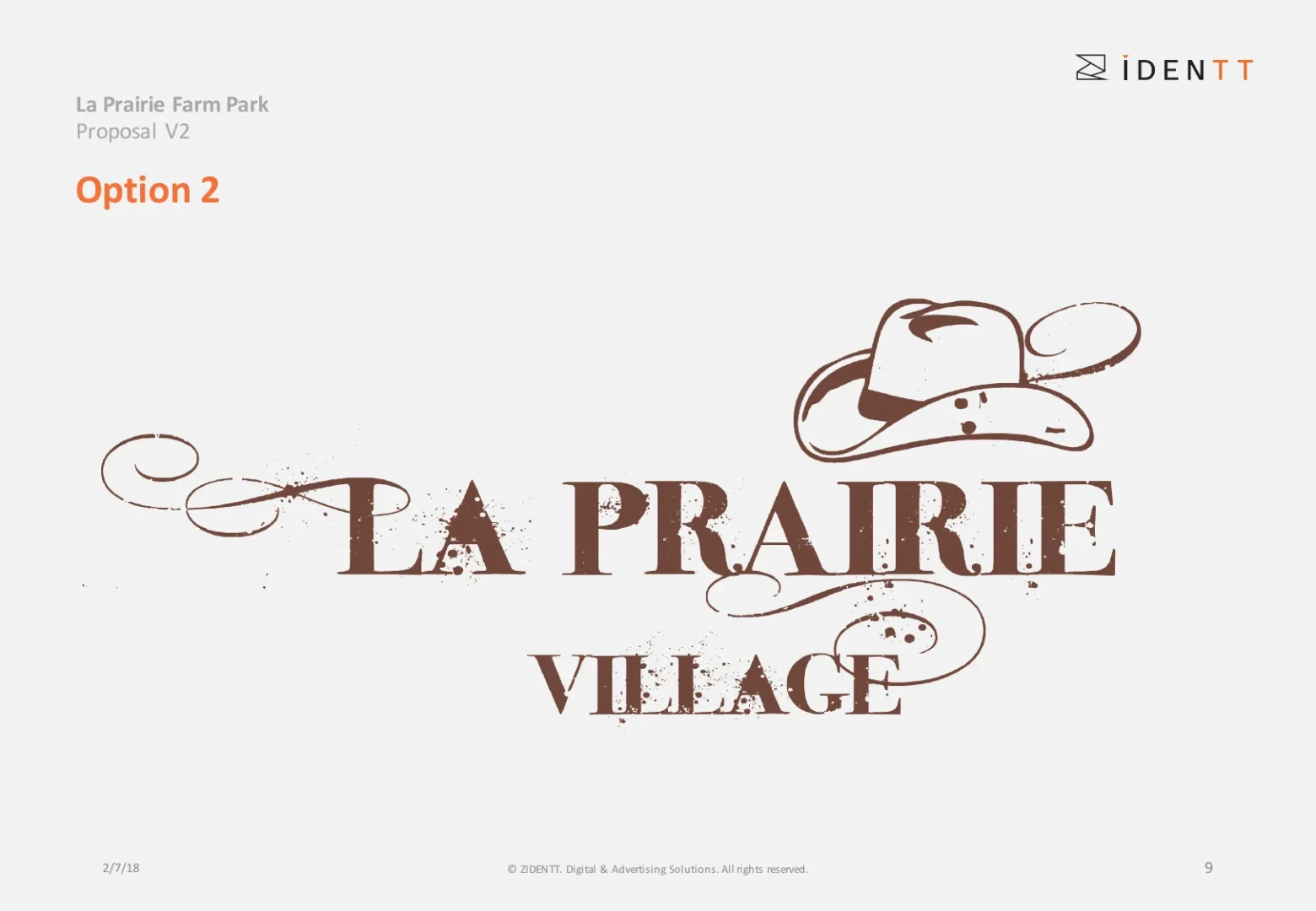
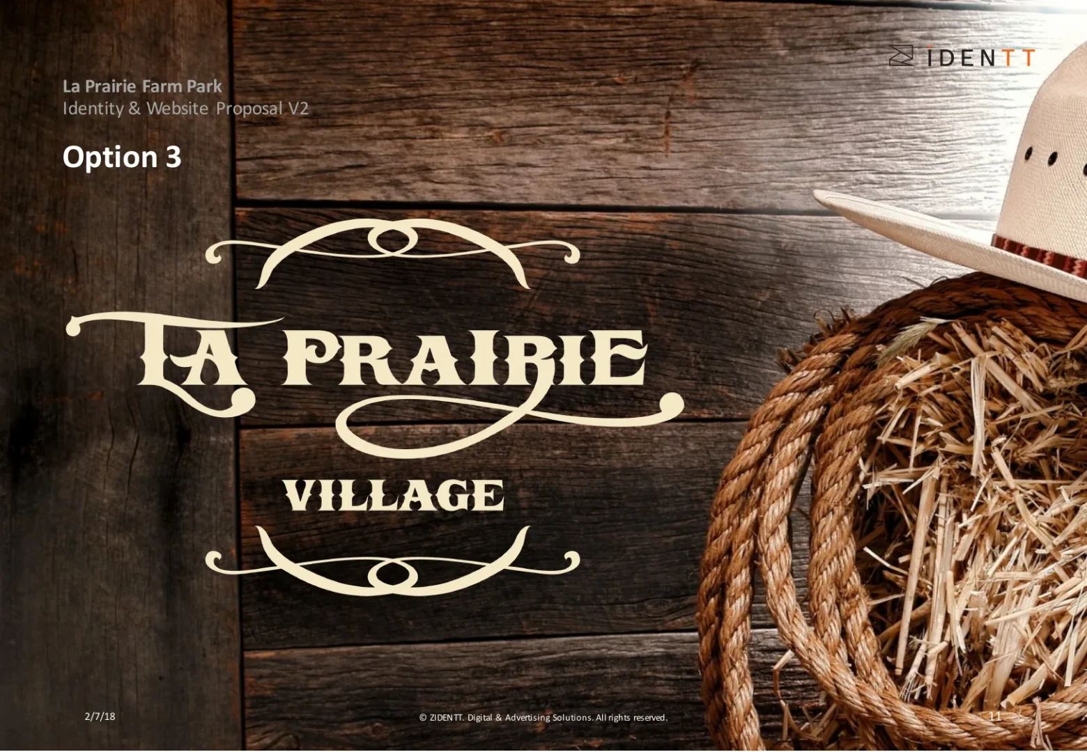
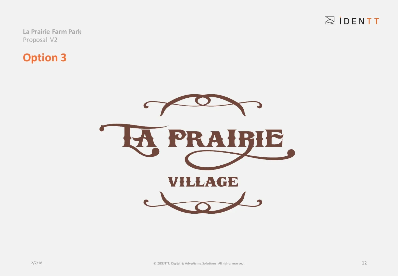
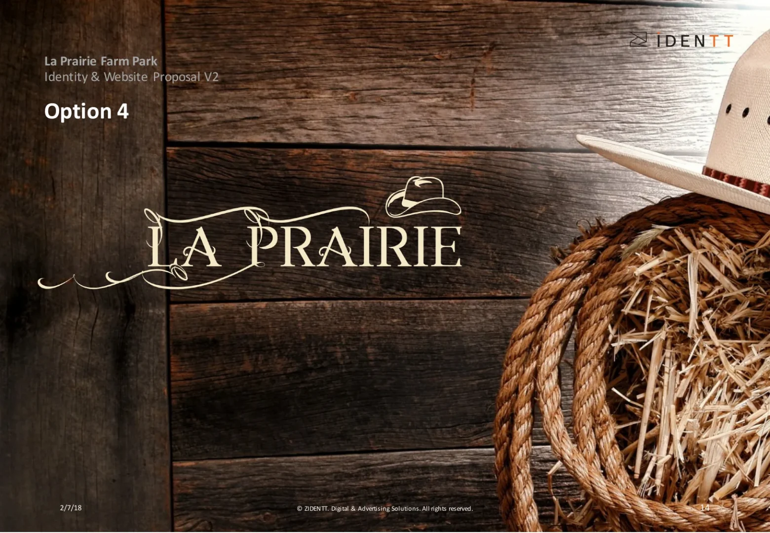
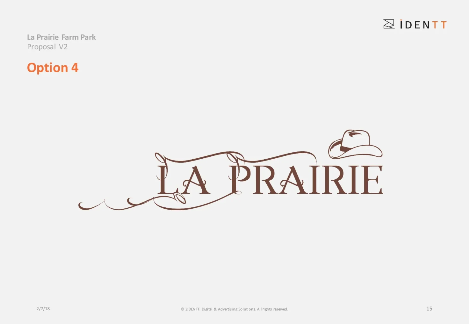
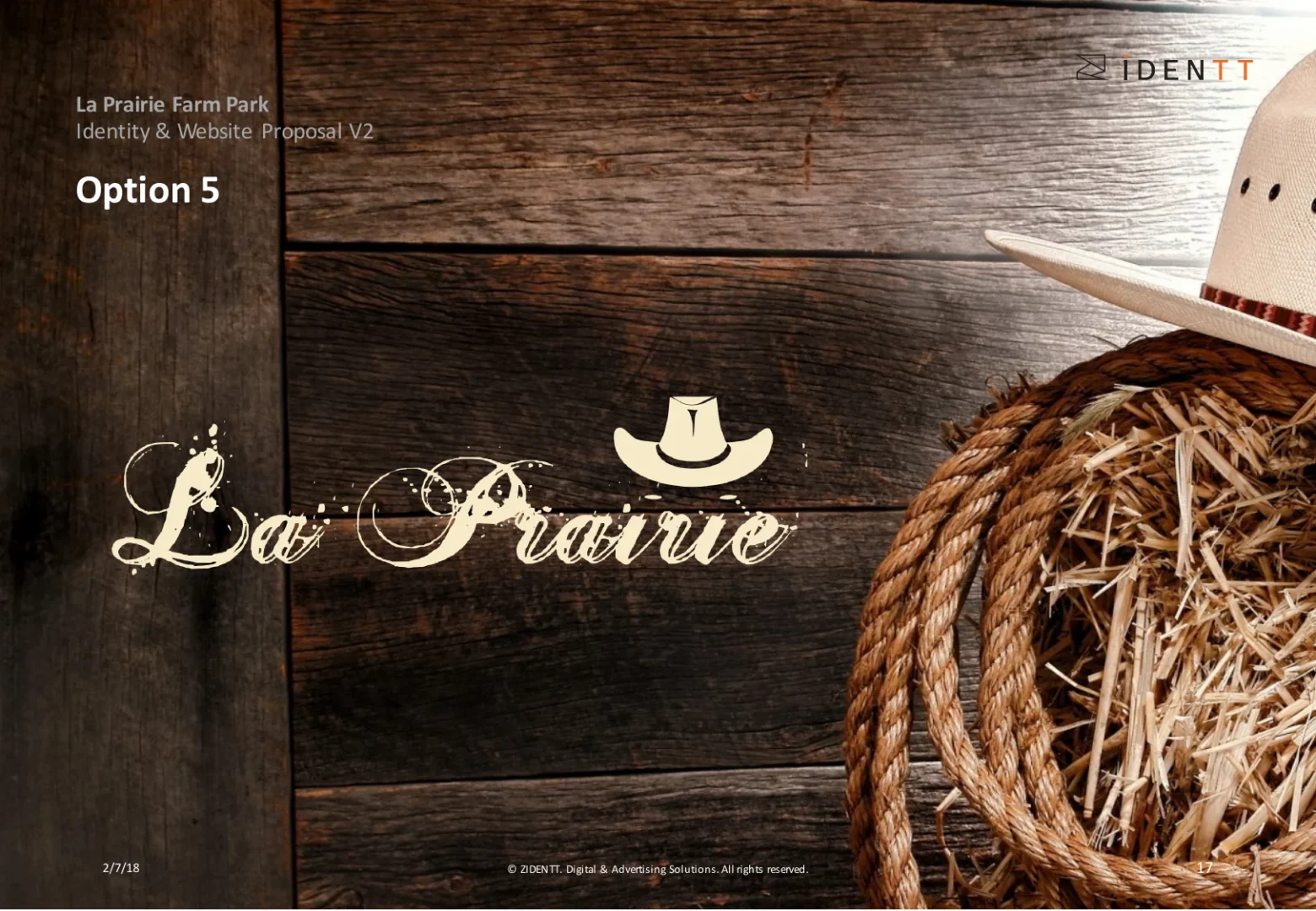
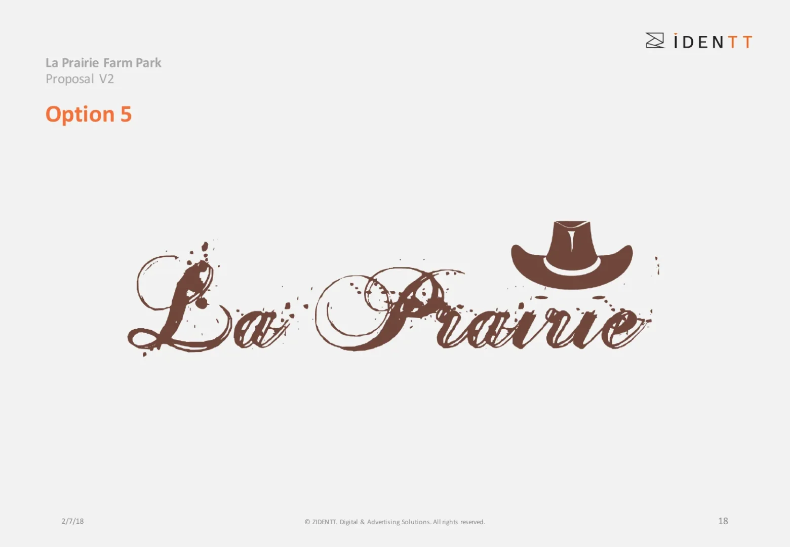
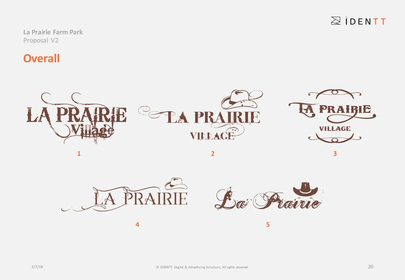
Logo and identity exploration for La Prairie Village, a western-themed farm park — five distinct directions, from ranch lettering to a cowboy-hat script, all inspired by vintage frontier signage.
La Prairie Village is a family farm park with a western, ranch-style experience. The name needed a mark with real character — playful for children, authentic enough for adults, and strong on signage, tickets and merchandise.
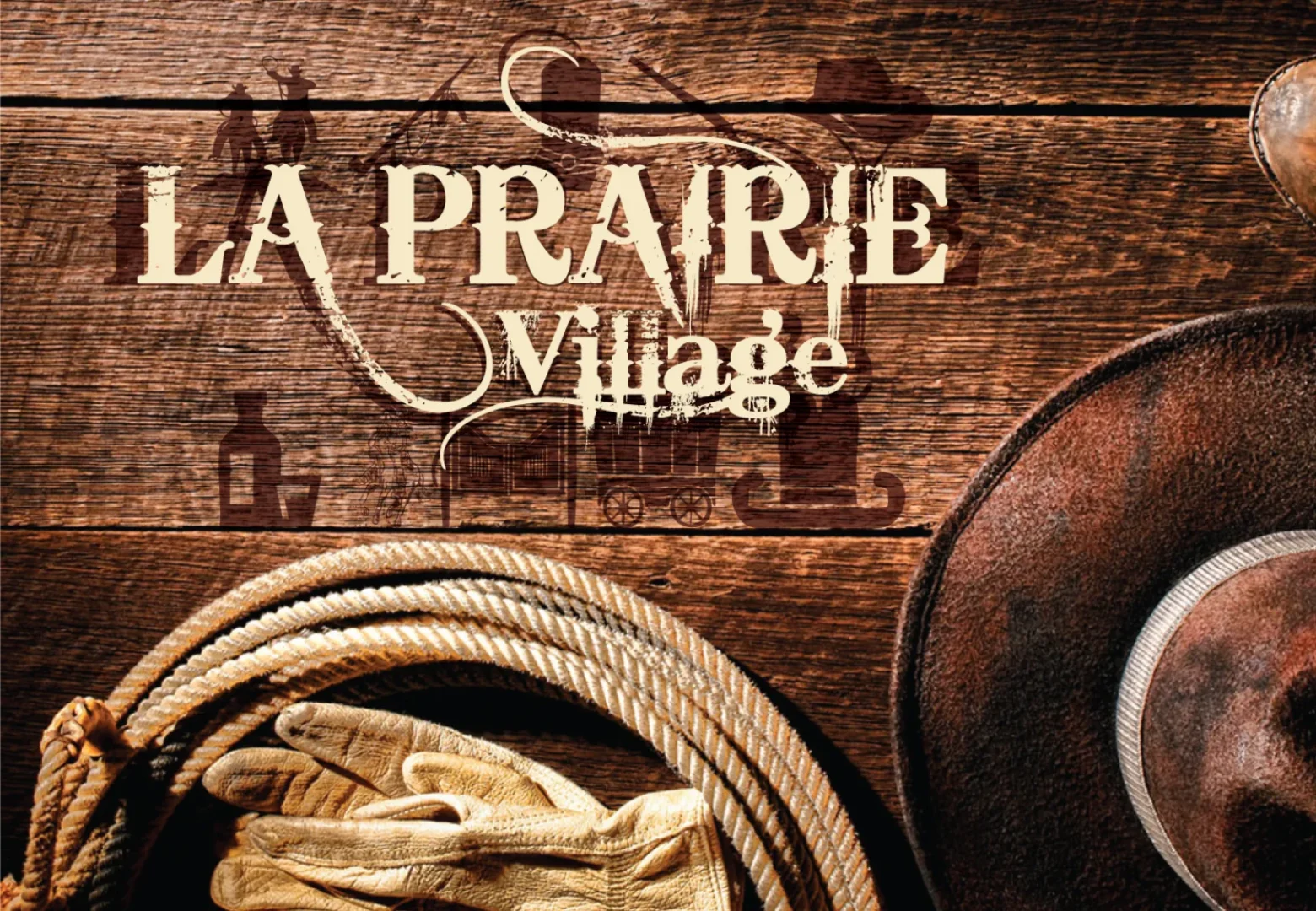
We started from vintage frontier references — saloon signs, ranch brands and old-west posters — and drew five very different directions, each with its own hand-made lettering. Every option was presented in context on weathered wood with rope and a cowboy hat, so the client could feel the brand, not just see a logo.
The client received a clear, comparable set of five identity directions, presented side by side to choose and refine the final La Prairie Village mark.
Gallery
Deliverables
Like what you see?